Negative space is commonly used in graphic design logos, posters, book covers, etc to make the designs more attractive. Many graphic designers use negative space to put more clarity and attractiveness in their logos and graphics. Now, the question arises of what negative space in graphic design is and how it is beneficial for graphic design.
In this article, we will understand negative space and how it is favorable for designing logos and graphics. We will also explore some effective ways to use negative space in designs to make them visually attractive.

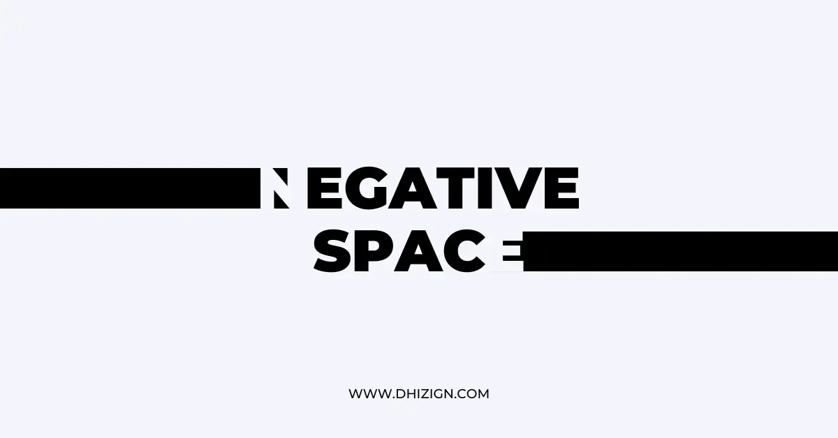
What is negative space in design?
Negative space can be demonstrated as a blank or empty area between the different elements or subjects of any image or graphic. It is the space that remains in the surroundings of any design objective and helps define the exact shape and formation of the image or graphic.
The main motive for adding negative space in the graphics is to provide a good balance or visual appearance. It allows the person to understand the graphic’s meaning and shape or formation. It mainly uses in the background. Most graphic designers use white to define negative space in any image or graphic.
This space is very important for creating an artistic effect in any image, which helps convey multiple messages uniquely. In a nutshell, negative space creates something attractive and definable in graphics.
Benefits of using negative space in design
Negative space is a very important or integral part of graphic design. Let’s understand the significant benefit of negative space in graphic designing with the help of the following points:
Maintain balance in element
There are different types of elements used to create an attractive image, these elements are useful only when they are defined precisely in the image. Negative space defines the shapes and formation of these elements and maintains a good balance between these elements.
One can easily recognize which element or shape was used to form the graphic with the help of a negative space, which creates a sense of harmony among the viewers. So, negative space is very important for maintaining appropriate balance in the graphic.
When you see negative space illustrations by the famous artist Noma bar, the designs look simple but very interesting and creative, similarly, you can see many famous brand logos that use this technique for branding and advertisements.
Create visual interest
Creating visual interest is another important benefit of utilizing negative space in graphic design. Any image or graphic design attracts the attention of any viewer when it is precisely defined and contains beautiful elements or colors.
If the graphic designer utilizes or designs negative space appropriately in any design, it becomes more attractive for the viewers and grapes their attention in just one glance. It is not necessary to use negative space in every design but if you use it, that can take your design to the next level and memorable for the people.
Facilitate good communication and delivery of the message
Negative space is very important for delivering the specific message of Designing any image or graphic to the viewer. If the graphic designer does not use negative space, it is impossible to define its elements and the messages behind it.
Let’s understand it with the help of an example, in the logo of FedEx, the designer used a negative space for creating arrows between the letter ‘E’ or ‘x’. This negative space in Arrow is used for suggesting speed and movement, which means it is delivering the basis of remaining active and speedy in life.
Another example of negative spaces used in the video Stop Hunger and Start peace for the World food programme by Noma bar and animator Ale accini.
Adds simplicity
Another major advantage of using negative space in the image and graphic design is, Negative space simplifies the design and makes it easier to understand.
By creating negative spaces between the elements or different objects in any graphics, the graphic designer can easily create a sense of clarity. Negative space enables the graphic designer to focus on the image’s main motive (delivering any specific message).
Branding
Negative space is crucial for creating a memorable visual identity and a unique branding design. By carefully utilizing negative space in the logo of brands, graphic designers can create a strong and cohesive visual identity.
It will also differentiate any brand’s logo, message, or logo from the others. Many popular brands like Apple use so much negative space in their logos to make them more attractive and mesmerizing. Negative space is a very important graphic design concept and is the core of attractive designs.
Best tips to use negative space effectively
Now, the negative space is very important for Designing. Now, let’s understand some best ways or tips to effectively utilize negative space in any graphic design. These are as follows:
Maintain a good balance between positive and negative space
Positive space can be defined as the space occupied by the elements and objects in any Graphic. Graphic Designers must maintain a good balance between the positive and negative space within the design.
Negative space is mainly used to make the design more explainable and attractive. So, it is important to balance both positive and negative space in a way that will deliver the message. Most brands keep the ratio of 50-50 while assigning positive and negative space in their logos.
Use negative space for highlighting other elements
Using so much negative space in any design is not a good idea, The graphic designer must use negative space to define the shape and formation of other elements in the graphic design. It will improve the clarity of the design and make it easier to understand.
Using negative space to create contrast
Using contrast color is becoming a major trend these days. Graphic designers can use contrast colors in negative spaces to make images more attractive and understandable. For instance, if the objects or elements of any logo are dark, light colors can be used as negative space or vice versa.
Conclusion
Negative space is a very good and beneficial aspect of graphic design. It can create a beautiful and eye-attractive design if it is utilized effectively. Many brand logos look attractive, not just because they contain very good elements and shapes, but because their graphic designer has efficiently utilized negative space. So negative space is very imperative to add value and an attractive look to any design.
FAQ:
Why do designers use negative space?

Designers use negative space to provide creative visuals, better composition, and interesting and memorable design, it also helps designers to make their designs stand out, and people to understand the design easily.
Which color is negative space in the design

Negative space color always depends on the design or the art, in this image if you are looking at the letter “M” then the black color is negative space and the Yellow area is Positive space, but if you are looking at 2 people then Black color is positive space and Yellow area is negative space.
